An HDR caret for a Markdown editor
Dinkus can render its caret in HDR, so it glows brighter than #FFFFFF on a capable display
In Dinkus's caret settings pane you will find a number of options to configure the caret: color, thickness, blink, and even the blink pattern.
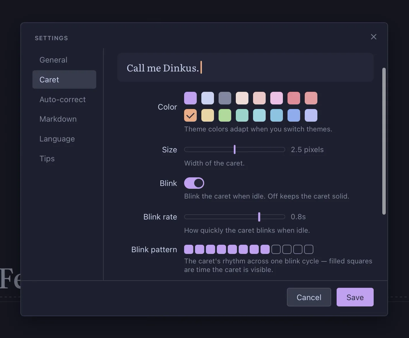
The caret settings are all good fun but not ground-breaking — with the possible exception of a toggle for a feature I think is both novel and useful. So novel, it may even be a first (I haven't seen any other app do this).
Enable "HDR Brightness" with an HDR-capable display and the caret is displayed brighter than pure white. This makes it really pop over any text. Little chance you'll lose such a vivid caret.
HDR support in CSS is currently spotty, so Dinkus renders the caret by clipping a tiny HDR image to the shape of the caret. In all honesty, the implementation is trivial and could be added to any editor.
Here's a video of the HDR caret (top window) in action. Hopefully it will work for you, but HDR support in browsers is not yet universal.
Let me know if there is prior art for this feature.
Update: The caret doesn't look quite as bright as it does on the desktop. Possibly something was lost in the video encoding. ¯\_(ツ)_/¯